The wrapped-website syndrome
An app that's just a website wrapped inside an app. That's exactly what triggers tons of Apple 4.2 rejections.
Most people use their phone with one hand. If your app's key actions require a stretch or a second hand, you are losing users silently — one friction point at a time.

Open any app on your phone right now. How are you holding it? If you are like the majority of smartphone users, you are using one hand, with your thumb doing most of the work. Mobile design that ignores this physical reality creates invisible friction that users feel but cannot always articulate. They just know the app feels slightly harder to use than it should.
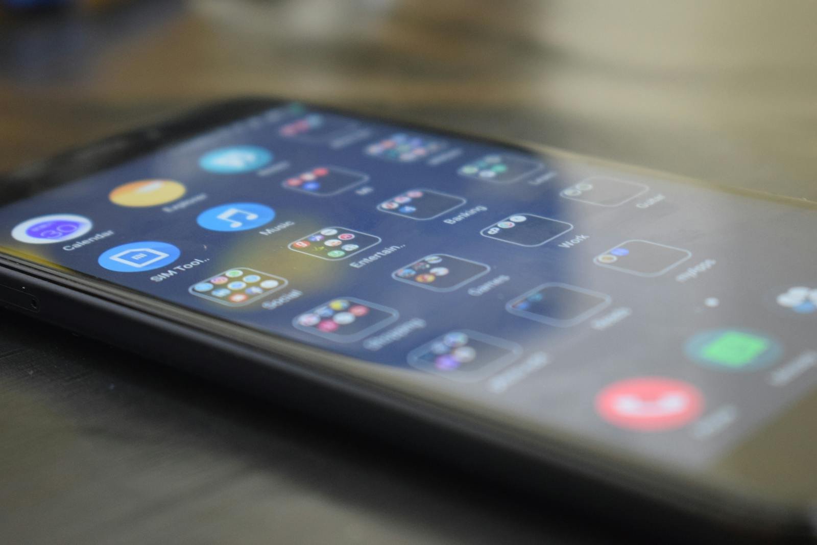
The "thumb zone" refers to the area of a smartphone screen that the thumb can reach comfortably without shifting hand grip. On a standard smartphone, this zone covers roughly the bottom two-thirds of the screen, with the most comfortable area being the lower-center. The upper corners are the hardest to reach with one hand — they require either repositioning the phone, using a second hand, or an awkward stretch that risks dropping the device.
The implications for interface design are direct. Any action you want users to take frequently — adding items to a cart, sending a message, confirming a booking — belongs in the comfortable thumb zone. Navigation elements buried in the top corners of the screen create measurable drop-off in interaction rates. This is not a design opinion; it is documented behavior from studies on mobile UI interaction patterns.
Thumb-first design does not mean cramming all controls into the bottom of the screen. It means making deliberate decisions about which actions are primary (frequent, essential) versus secondary (rare, confirmatory). Primary actions get placed in the thumb zone. Secondary actions — like account settings, help documentation, or destructive actions like "delete account" — can live higher up, where reaching them requires more intention.
Bottom navigation bars, floating action buttons, and gesture-based navigation (swipe to go back, swipe to dismiss) are all design patterns that emerged specifically from thumb-zone thinking. Apps that embrace these patterns consistently outperform those that port a desktop interface onto a mobile screen without rethinking the interaction model.
The damage from poor thumb ergonomics is subtle and cumulative. No user will uninstall your app because one button is slightly out of reach. But if ten interactions per session each require a small extra effort, the cognitive load compounds. The app feels tiring. Users open it less frequently. Session length shortens. Retention drops — and you rarely know why, because the issue never triggers a complaint; it just quietly reduces usage until the app becomes irrelevant in the user's daily routine.
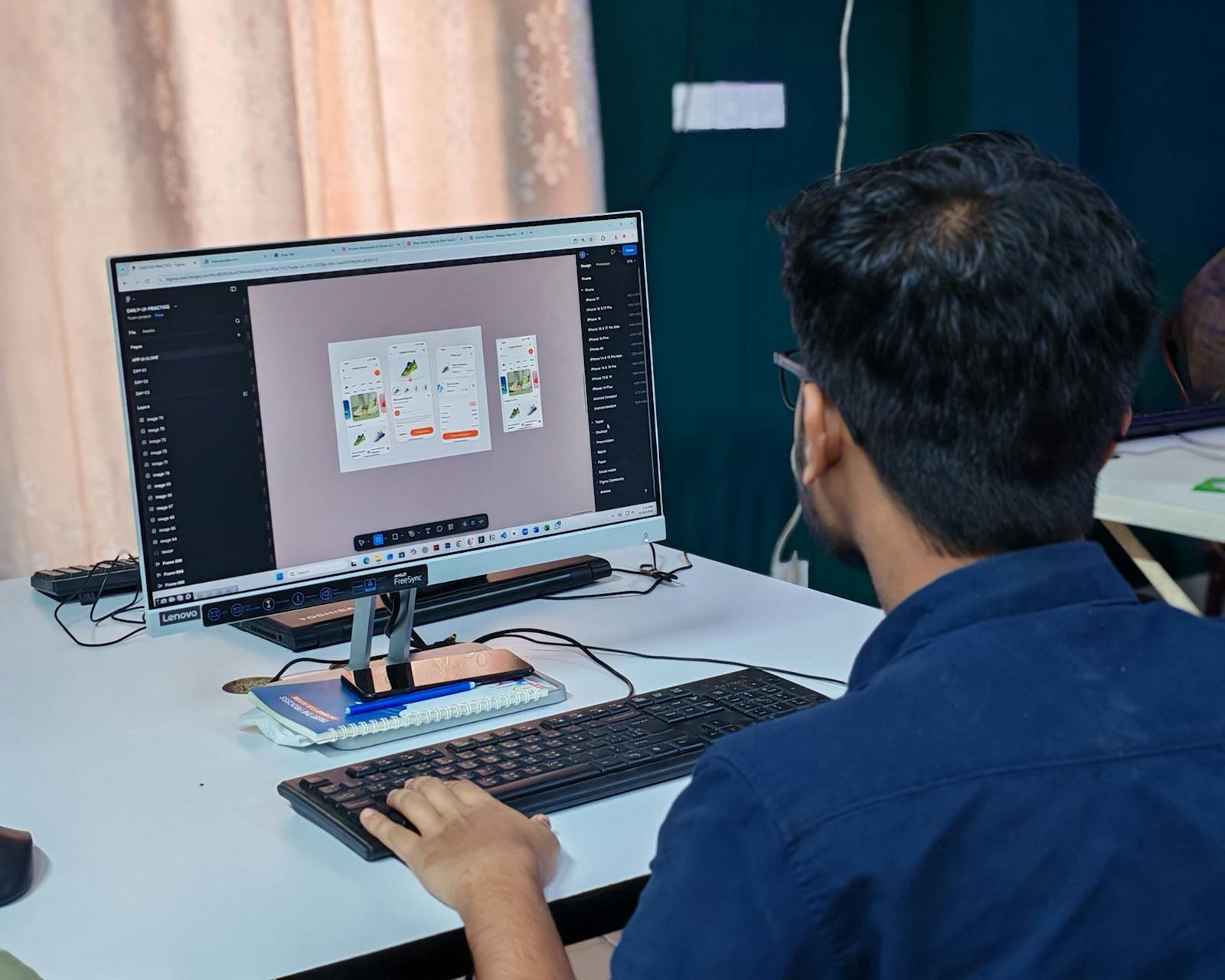
In short: designing for the thumb is designing for retention. I apply thumb-zone principles from the first wireframe of every project I build, because fixing the interaction model after launch is far more expensive than getting it right at the start.
Want a mobile app designed from the user's hand up? Let's start with a conversation.
12 years of experience, iOS + Android, one dedicated contact. Free 15-minute call to scope your need — no commitment, no jargon.
Book a call →
Open any app on your phone right now. How are you holding it? If you are like the majority of smartphone users, you are using one hand, with your thumb doing most of the work. Mobile design that ignores this physical reality creates invisible friction that users feel but cannot always articulate. They just know the app feels slightly harder to use than it should.
The "thumb zone" refers to the area of a smartphone screen that the thumb can reach comfortably without shifting hand grip. On a standard smartphone, this zone covers roughly the bottom two-thirds of the screen, with the most comfortable area being the lower-center. The upper corners are the hardest to reach with one hand — they require either repositioning the phone, using a second hand, or an awkward stretch that risks dropping the device.
The implications for interface design are direct. Any action you want users to take frequently — adding items to a cart, sending a message, confirming a booking — belongs in the comfortable thumb zone. Navigation elements buried in the top corners of the screen create measurable drop-off in interaction rates. This is not a design opinion; it is documented behavior from studies on mobile UI interaction patterns.
Thumb-first design does not mean cramming all controls into the bottom of the screen. It means making deliberate decisions about which actions are primary (frequent, essential) versus secondary (rare, confirmatory). Primary actions get placed in the thumb zone. Secondary actions — like account settings, help documentation, or destructive actions like "delete account" — can live higher up, where reaching them requires more intention.
Bottom navigation bars, floating action buttons, and gesture-based navigation (swipe to go back, swipe to dismiss) are all design patterns that emerged specifically from thumb-zone thinking. Apps that embrace these patterns consistently outperform those that port a desktop interface onto a mobile screen without rethinking the interaction model.
The damage from poor thumb ergonomics is subtle and cumulative. No user will uninstall your app because one button is slightly out of reach. But if ten interactions per session each require a small extra effort, the cognitive load compounds. The app feels tiring. Users open it less frequently. Session length shortens. Retention drops — and you rarely know why, because the issue never triggers a complaint; it just quietly reduces usage until the app becomes irrelevant in the user's daily routine.
In short: designing for the thumb is designing for retention. I apply thumb-zone principles from the first wireframe of every project I build, because fixing the interaction model after launch is far more expensive than getting it right at the start.
Want a mobile app designed from the user's hand up? Let's start with a conversation.
12 years of experience, iOS + Android, one dedicated contact. Free 15-minute call to scope your need — no commitment, no jargon.
Book a call →We write about mobile app development, user experience design, App Store optimization, project management, and industry trends. Our articles are based on real experience from client projects.
We aim to publish regularly with a focus on quality over quantity. Each article is written from hands-on experience, not generic advice.
Absolutely! Feel free to reach out via our contact page or book a consultation. We love hearing what questions our readers and clients have.