The wrapped-website syndrome
An app that's just a website wrapped inside an app. That's exactly what triggers tons of Apple 4.2 rejections.
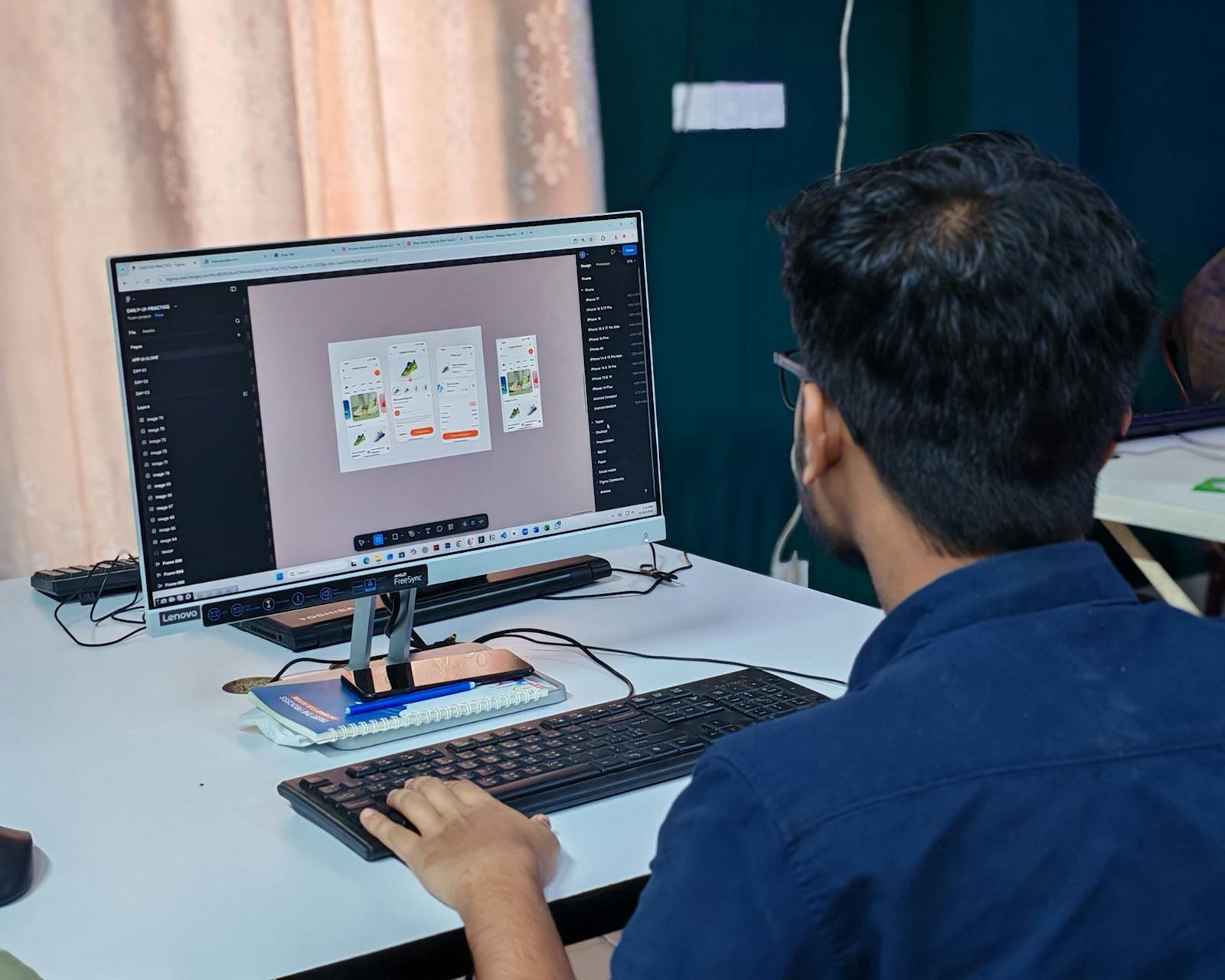
There's a world between a recent iPhone on fiber Wi-Fi and a mid-range phone in the subway. Users don't judge your code. They judge how the app feels.
"Our app works fine on our phones."
Dangerous sentence. Very dangerous.
Because there is a huge difference between a recent iPhone connected to fiber Wi-Fi in an office… and a mid-range Android phone inside a subway.
People forget one thing : users do not judge your code. They judge how the app feels. And feelings are brutal.
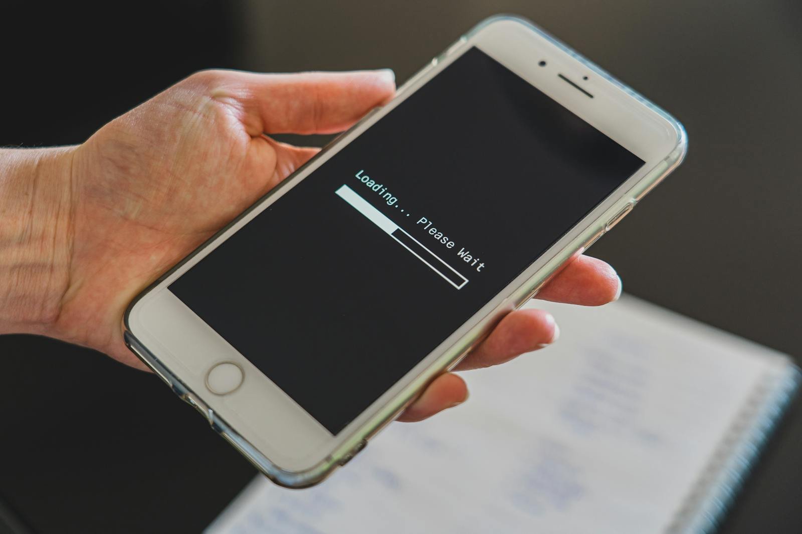
If a screen takes too long to load : users get annoyed, they tap everywhere, they think the app is broken. Even if technically everything works.
It's exactly like waiting for a waiter in a restaurant. If nobody comes for 15 minutes, the service feels terrible. Even if the kitchen is working hard. Mobile apps work the same way.
According to Google (2024), 53% of mobile visits are abandoned if loading exceeds 3 seconds. Three seconds. Not thirty.
Silence creates stress. That's why loading animations, skeleton screens, and micro-interactions matter. Not because they "look modern". But because they reassure users.
It's a trust issue.
And many projects fall into the same trap. They want ultra-spectacular interfaces. Animations everywhere. Effects everywhere.
Spoiler : if your app is lagging, nobody cares about the animation. Nobody.
Users mainly want to understand quickly, navigate quickly, get results quickly. Perceived speed matters enormously. Sometimes more than actual speed.
An app can be technically fast… but feel slow. And the opposite is also true. Why ?
Because the human brain hates uncertainty. When users don't understand what's happening, they panic.
That's why even a tiny button color change on tap can massively improve the experience. The brain understands : "Okay. The app received my action."
Simple. But powerful.
Apple's Human Interface Guidelines are categorical : every user action must receive immediate visual feedback. That's the trust contract between the app and the person in front of it.
So how do you improve the feeling of speed ? A few simple rules.
Google's Material Design guide recommends short transitions (200-300 ms) so users keep that sense of instantaneity. Anything longer, and the brain starts perceiving a delay.
And most importantly : test the app in real conditions. Not only in the office. Test with poor network, on older devices, with low battery, with many apps running. That's real life.
Because users will never say : "I believe your main thread is blocked." Never.
They will simply say : "Your app is buggy." And they will leave.
They tap. They quit. They forget.
A fast app does not only create a good experience. It creates an impression of professionalism. And in mobile, that impression matters a lot. Because smooth apps inspire trust. Slow apps create doubt.
And you ? Would you rather have a beautiful but slow app… or a simple ultra-smooth one ? Book a 15-minute call to audit the perceived smoothness of your mobile product.
12 years of experience, iOS + Android, one dedicated contact. Free 15-minute call to scope your need — no commitment, no jargon.
Book a call →
"Our app works fine on our phones."
Dangerous sentence. Very dangerous.
Because there is a huge difference between a recent iPhone connected to fiber Wi-Fi in an office… and a mid-range Android phone inside a subway.
People forget one thing : users do not judge your code. They judge how the app feels. And feelings are brutal.
If a screen takes too long to load : users get annoyed, they tap everywhere, they think the app is broken. Even if technically everything works.
It's exactly like waiting for a waiter in a restaurant. If nobody comes for 15 minutes, the service feels terrible. Even if the kitchen is working hard. Mobile apps work the same way.
According to Google (2024), 53% of mobile visits are abandoned if loading exceeds 3 seconds. Three seconds. Not thirty.
Silence creates stress. That's why loading animations, skeleton screens, and micro-interactions matter. Not because they "look modern". But because they reassure users.
It's a trust issue.
And many projects fall into the same trap. They want ultra-spectacular interfaces. Animations everywhere. Effects everywhere.
Spoiler : if your app is lagging, nobody cares about the animation. Nobody.
Users mainly want to understand quickly, navigate quickly, get results quickly. Perceived speed matters enormously. Sometimes more than actual speed.
An app can be technically fast… but feel slow. And the opposite is also true. Why ?
Because the human brain hates uncertainty. When users don't understand what's happening, they panic.
That's why even a tiny button color change on tap can massively improve the experience. The brain understands : "Okay. The app received my action."
Simple. But powerful.
Apple's Human Interface Guidelines are categorical : every user action must receive immediate visual feedback. That's the trust contract between the app and the person in front of it.
So how do you improve the feeling of speed ? A few simple rules.
Google's Material Design guide recommends short transitions (200-300 ms) so users keep that sense of instantaneity. Anything longer, and the brain starts perceiving a delay.
And most importantly : test the app in real conditions. Not only in the office. Test with poor network, on older devices, with low battery, with many apps running. That's real life.
Because users will never say : "I believe your main thread is blocked." Never.
They will simply say : "Your app is buggy." And they will leave.
They tap. They quit. They forget.
A fast app does not only create a good experience. It creates an impression of professionalism. And in mobile, that impression matters a lot. Because smooth apps inspire trust. Slow apps create doubt.
And you ? Would you rather have a beautiful but slow app… or a simple ultra-smooth one ? Book a 15-minute call to audit the perceived smoothness of your mobile product.
12 years of experience, iOS + Android, one dedicated contact. Free 15-minute call to scope your need — no commitment, no jargon.
Book a call →We write about mobile app development, user experience design, App Store optimization, project management, and industry trends. Our articles are based on real experience from client projects.
We aim to publish regularly with a focus on quality over quantity. Each article is written from hands-on experience, not generic advice.
Absolutely! Feel free to reach out via our contact page or book a consultation. We love hearing what questions our readers and clients have.