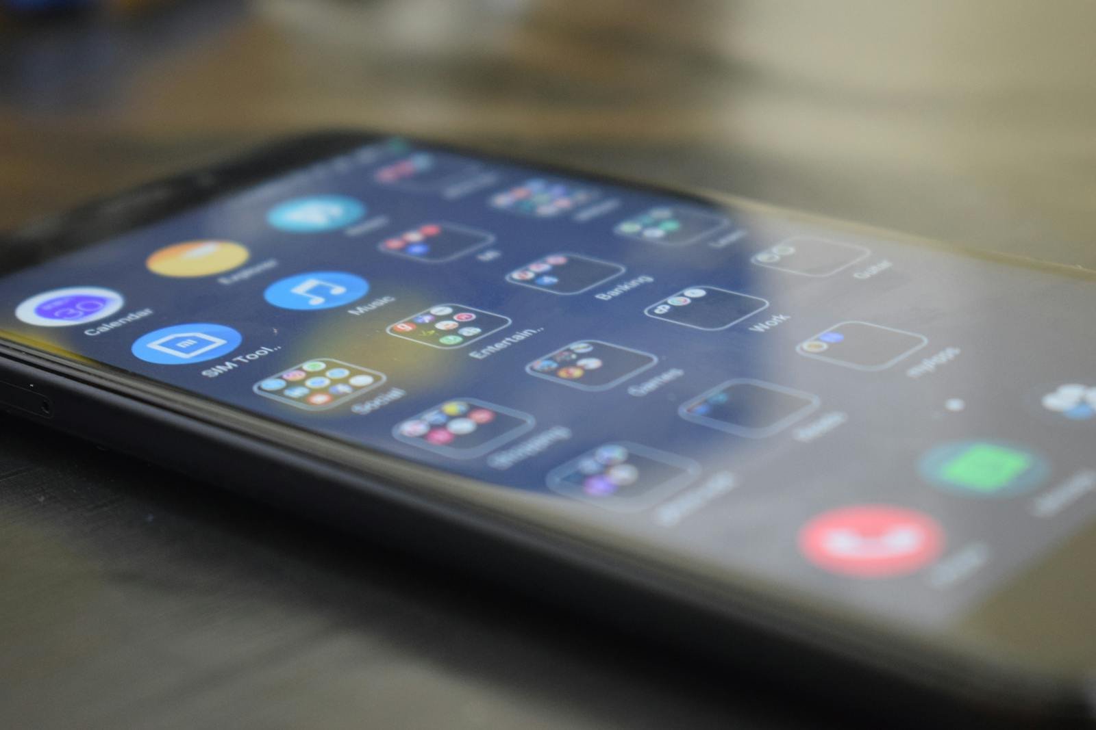
The wrapped-website syndrome
An app that's just a website wrapped inside an app. That's exactly what triggers tons of Apple 4.2 rejections.
"Let's redo the button again." Meanwhile, the real product problem stays elsewhere. The product is trying to look pretty before being clear.
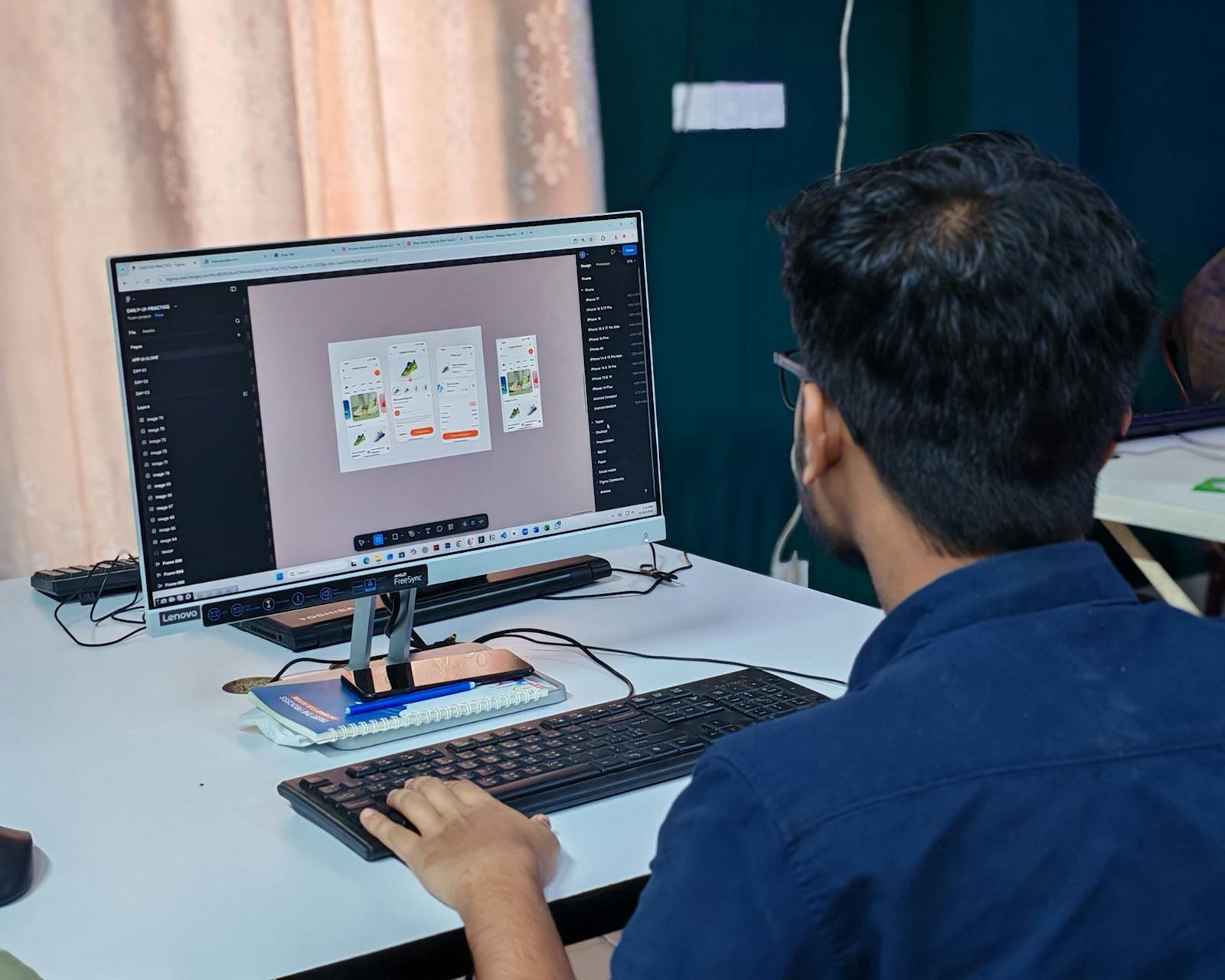
"Let's redo the button again."
Then : change the color, adjust the shadow, nudge the text, test a new animation. Meanwhile… the real product problem stays completely elsewhere.
This is something we see all the time in mobile projects. The product is trying to be "pretty"… before being clear. And honestly, that's a huge trap.
Because a gorgeous but incomprehensible interface is still a bad interface.
The problem is that many teams spend tons of time on visual details, micro-animations, aesthetic elements. While the user doesn't even know yet where to tap, what to do, how to go back, or whether their action worked.
And that's exactly where a major confusion appears between aesthetic design and functional design.
Design isn't only about "looking nice". It's mainly about :
Apple's Human Interface Guidelines place clarity before visual richness. It's the first principle, not the last.
The best interfaces often feel very simple. Because they remove huge amounts of unnecessary thinking. The user moves forward naturally.
And honestly, that's much harder to design than a "spectacular" interface.
Because in the end, the user doesn't come to admire your buttons. They come to accomplish a task. Book. Buy. Understand. Order. Listen.
And anything that unnecessarily slows that flow usually creates frustration, hesitation, or drop-off.
So good UX isn't the one that grabs the most attention. It's often the one that makes you forget the interface entirely.
Is your team optimizing the button… or the flow leading to it ? Book a 15-minute call to identify where the real design effort should go.
12 years of experience, iOS + Android, one dedicated contact. Free 15-minute call to scope your need — no commitment, no jargon.
Book a call →
"Let's redo the button again."
Then : change the color, adjust the shadow, nudge the text, test a new animation. Meanwhile… the real product problem stays completely elsewhere.
This is something we see all the time in mobile projects. The product is trying to be "pretty"… before being clear. And honestly, that's a huge trap.
Because a gorgeous but incomprehensible interface is still a bad interface.
The problem is that many teams spend tons of time on visual details, micro-animations, aesthetic elements. While the user doesn't even know yet where to tap, what to do, how to go back, or whether their action worked.
And that's exactly where a major confusion appears between aesthetic design and functional design.
Design isn't only about "looking nice". It's mainly about :
Apple's Human Interface Guidelines place clarity before visual richness. It's the first principle, not the last.
The best interfaces often feel very simple. Because they remove huge amounts of unnecessary thinking. The user moves forward naturally.
And honestly, that's much harder to design than a "spectacular" interface.
Because in the end, the user doesn't come to admire your buttons. They come to accomplish a task. Book. Buy. Understand. Order. Listen.
And anything that unnecessarily slows that flow usually creates frustration, hesitation, or drop-off.
So good UX isn't the one that grabs the most attention. It's often the one that makes you forget the interface entirely.
Is your team optimizing the button… or the flow leading to it ? Book a 15-minute call to identify where the real design effort should go.
12 years of experience, iOS + Android, one dedicated contact. Free 15-minute call to scope your need — no commitment, no jargon.
Book a call →We write about mobile app development, user experience design, App Store optimization, project management, and industry trends. Our articles are based on real experience from client projects.
We aim to publish regularly with a focus on quality over quantity. Each article is written from hands-on experience, not generic advice.
Absolutely! Feel free to reach out via our contact page or book a consultation. We love hearing what questions our readers and clients have.