The wrapped-website syndrome
An app that's just a website wrapped inside an app. That's exactly what triggers tons of Apple 4.2 rejections.
Your app store screenshots are your most-viewed marketing material. Most developers treat them as an afterthought. The best ones treat them as a conversion tool.
Before a user reads a single word of your app description, they have already scrolled through your screenshots. Research from Apple and Google consistently shows that screenshots are the number one factor in the decision to download. Despite this, the majority of apps treat screenshots as a box to check rather than a strategic asset. The difference in conversion rates between thoughtful and generic screenshots is not marginal — it is often the single biggest lever available to improve download numbers without changing the product itself.
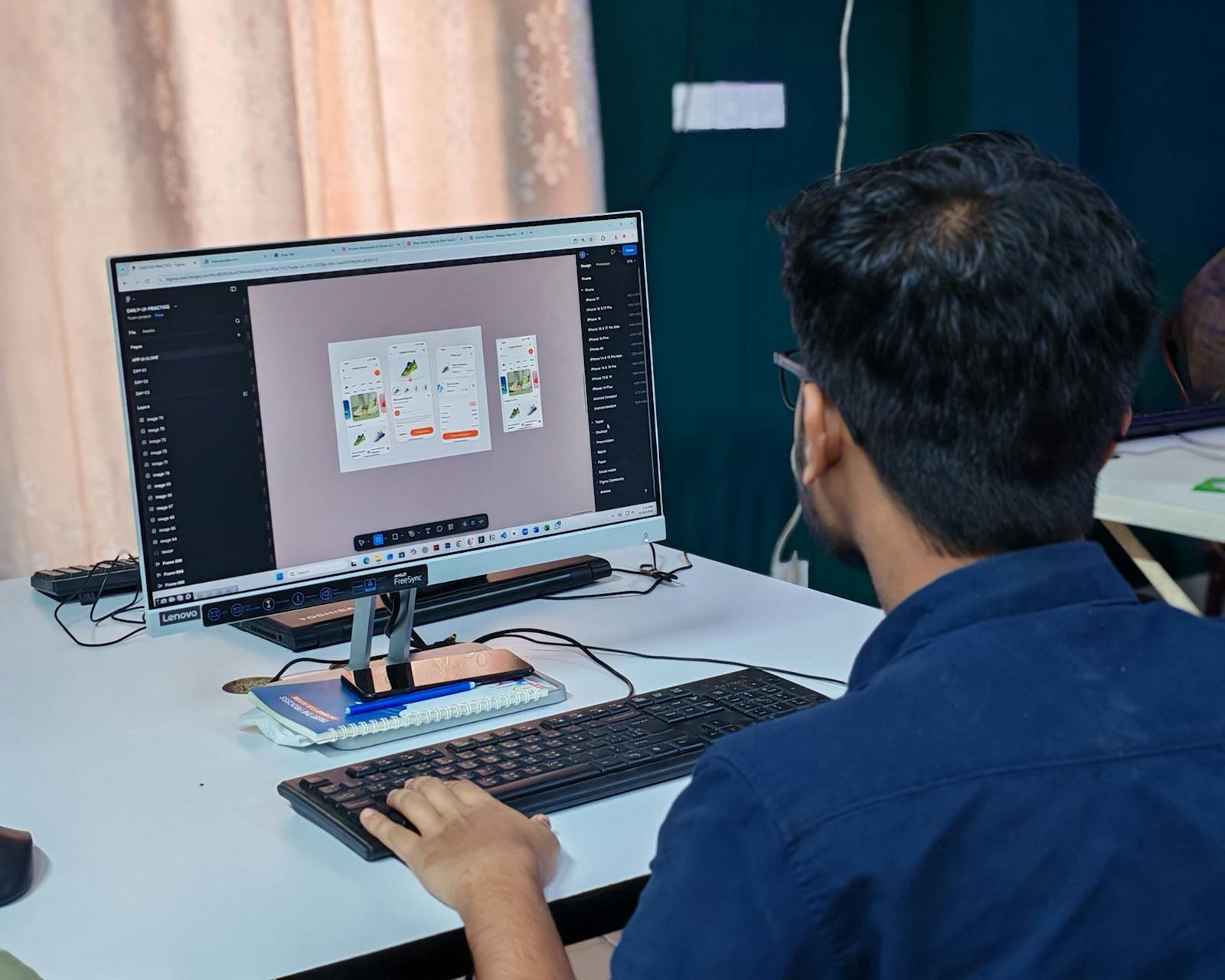
A screenshot is not a picture of your UI. It is a promise about what the user's life will look like if they download your app. The most effective screenshots focus on outcomes and benefits, not interface features. Instead of showing a settings screen with a caption explaining what each toggle does, show the result of using the app in a real context — someone completing a task faster, enjoying a feature, or experiencing a moment of satisfaction the app enables.
The first screenshot in your set is the most critical. It is the only one most users will see before deciding whether to keep scrolling. It should communicate your core value proposition in under three seconds. A screenshot with a clean UI, a short punchy headline, and a clear visual benefit passes that test. A screenshot of an empty state with no context fails it.
Effective app store screenshots typically combine three elements: the app UI itself, a short text overlay that tells the story behind the UI, and a device frame or background that provides visual context. The text should be short — five words is better than fifteen. It should complete the thought "This app lets you..." in a way that creates desire, not just description.
Color matters. Your screenshots should feel cohesive as a set and consistent with your brand. Users scroll through them in sequence, so each screenshot should either deepen the same story or introduce a new compelling benefit. Avoid the trap of dedicating screenshots to minor features — every screenshot that does not communicate a strong benefit is a wasted opportunity.
Both the App Store (via Apple's Product Page Optimization) and Google Play (via Store Listing Experiments) allow developers to A/B test screenshots directly. This is one of the most powerful optimization levers available for free, and it is dramatically underused. Running a simple test with two versions of your first screenshot can produce conversion rate data that would cost thousands of euros to gather through any other channel.
I help clients develop screenshot strategies as part of the launch planning process and set up A/B tests post-launch to continuously improve the conversion rate on their listing. What happens before the download matters as much as what happens inside the app.
Ready to turn your app store page into a proper conversion asset? Let's talk about your listing.
12 years of experience, iOS + Android, one dedicated contact. Free 15-minute call to scope your need — no commitment, no jargon.
Book a call →
Before a user reads a single word of your app description, they have already scrolled through your screenshots. Research from Apple and Google consistently shows that screenshots are the number one factor in the decision to download. Despite this, the majority of apps treat screenshots as a box to check rather than a strategic asset. The difference in conversion rates between thoughtful and generic screenshots is not marginal — it is often the single biggest lever available to improve download numbers without changing the product itself.
A screenshot is not a picture of your UI. It is a promise about what the user's life will look like if they download your app. The most effective screenshots focus on outcomes and benefits, not interface features. Instead of showing a settings screen with a caption explaining what each toggle does, show the result of using the app in a real context — someone completing a task faster, enjoying a feature, or experiencing a moment of satisfaction the app enables.
The first screenshot in your set is the most critical. It is the only one most users will see before deciding whether to keep scrolling. It should communicate your core value proposition in under three seconds. A screenshot with a clean UI, a short punchy headline, and a clear visual benefit passes that test. A screenshot of an empty state with no context fails it.
Effective app store screenshots typically combine three elements: the app UI itself, a short text overlay that tells the story behind the UI, and a device frame or background that provides visual context. The text should be short — five words is better than fifteen. It should complete the thought "This app lets you..." in a way that creates desire, not just description.
Color matters. Your screenshots should feel cohesive as a set and consistent with your brand. Users scroll through them in sequence, so each screenshot should either deepen the same story or introduce a new compelling benefit. Avoid the trap of dedicating screenshots to minor features — every screenshot that does not communicate a strong benefit is a wasted opportunity.
Both the App Store (via Apple's Product Page Optimization) and Google Play (via Store Listing Experiments) allow developers to A/B test screenshots directly. This is one of the most powerful optimization levers available for free, and it is dramatically underused. Running a simple test with two versions of your first screenshot can produce conversion rate data that would cost thousands of euros to gather through any other channel.
I help clients develop screenshot strategies as part of the launch planning process and set up A/B tests post-launch to continuously improve the conversion rate on their listing. What happens before the download matters as much as what happens inside the app.
Ready to turn your app store page into a proper conversion asset? Let's talk about your listing.
12 years of experience, iOS + Android, one dedicated contact. Free 15-minute call to scope your need — no commitment, no jargon.
Book a call →We write about mobile app development, user experience design, App Store optimization, project management, and industry trends. Our articles are based on real experience from client projects.
We aim to publish regularly with a focus on quality over quantity. Each article is written from hands-on experience, not generic advice.
Absolutely! Feel free to reach out via our contact page or book a consultation. We love hearing what questions our readers and clients have.