The wrapped-website syndrome
An app that's just a website wrapped inside an app. That's exactly what triggers tons of Apple 4.2 rejections.
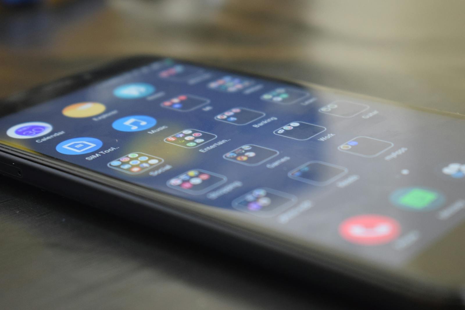
Dark mode became a user expectation almost overnight. But implementing it properly requires more than inverting your colors — it demands a complete rethinking of your visual system.

Dark mode went from a niche preference to a near-universal expectation in the space of a few years. Apple introduced system-wide dark mode in iOS 13, Android followed with Android 10, and users adopted both overnight. Today, an app that does not support dark mode feels incomplete in a way that users notice even if they cannot name the reason. But dark mode is significantly more complex to implement correctly than most non-developers realize.
The most common mistake in dark mode implementation is treating it as a simple color inversion. Take the light UI, flip white to black, done. In practice, this approach produces UIs that feel wrong, have poor contrast in unexpected places, and look amateur. The reason is that dark mode requires its own color system, not a negative of the light one.
Surfaces in dark mode should not be pure black (#000000). Pure black on OLED screens can create harsh contrast with lighter elements that causes eye strain. The correct approach uses a hierarchy of dark surfaces — dark backgrounds at one level, slightly lighter panels at another, and accent colors that are muted compared to their light-mode equivalents to avoid glare. Text colors also need recalibration; pure white text on dark backgrounds is often too harsh and should be softened to a near-white.
Dark mode is not just aesthetic. On OLED screens — which are now the default on most mid-range and premium smartphones — true black pixels are literally turned off, consuming zero power. A well-implemented dark mode can meaningfully extend battery life for users who spend significant time in your app, which is a real and measurable benefit they will associate with your product's quality.
From an accessibility standpoint, dark mode reduces light emission in low-light environments, which is especially valuable for users with photosensitivity, migraine disorders, or those simply using a phone in bed at night. Designing with accessibility as a first-class concern — rather than an afterthought — is both ethically appropriate and commercially smart, as it expands your addressable user base.
The most important factor that businesses overlook in dark mode design is brand identity. Your logo, primary colors, and visual language were likely designed for a white background. In dark mode, a saturated red or blue that looks vibrant on white can become overwhelming and difficult to look at on a dark surface. Proper dark mode design involves creating a secondary color palette that maintains brand recognition while adapting to the new visual context.
I approach dark mode as a first-class design requirement in every project I build, not an optional add-on delivered in a future update. Building a coherent dark mode from the start is three times faster than retrofitting one onto an existing light-mode design.
Want an app that looks polished in both light and dark mode from day one? Let's talk about your visual system.
12 years of experience, iOS + Android, one dedicated contact. Free 15-minute call to scope your need — no commitment, no jargon.
Book a call →
Dark mode went from a niche preference to a near-universal expectation in the space of a few years. Apple introduced system-wide dark mode in iOS 13, Android followed with Android 10, and users adopted both overnight. Today, an app that does not support dark mode feels incomplete in a way that users notice even if they cannot name the reason. But dark mode is significantly more complex to implement correctly than most non-developers realize.
The most common mistake in dark mode implementation is treating it as a simple color inversion. Take the light UI, flip white to black, done. In practice, this approach produces UIs that feel wrong, have poor contrast in unexpected places, and look amateur. The reason is that dark mode requires its own color system, not a negative of the light one.
Surfaces in dark mode should not be pure black (#000000). Pure black on OLED screens can create harsh contrast with lighter elements that causes eye strain. The correct approach uses a hierarchy of dark surfaces — dark backgrounds at one level, slightly lighter panels at another, and accent colors that are muted compared to their light-mode equivalents to avoid glare. Text colors also need recalibration; pure white text on dark backgrounds is often too harsh and should be softened to a near-white.
Dark mode is not just aesthetic. On OLED screens — which are now the default on most mid-range and premium smartphones — true black pixels are literally turned off, consuming zero power. A well-implemented dark mode can meaningfully extend battery life for users who spend significant time in your app, which is a real and measurable benefit they will associate with your product's quality.
From an accessibility standpoint, dark mode reduces light emission in low-light environments, which is especially valuable for users with photosensitivity, migraine disorders, or those simply using a phone in bed at night. Designing with accessibility as a first-class concern — rather than an afterthought — is both ethically appropriate and commercially smart, as it expands your addressable user base.
The most important factor that businesses overlook in dark mode design is brand identity. Your logo, primary colors, and visual language were likely designed for a white background. In dark mode, a saturated red or blue that looks vibrant on white can become overwhelming and difficult to look at on a dark surface. Proper dark mode design involves creating a secondary color palette that maintains brand recognition while adapting to the new visual context.
I approach dark mode as a first-class design requirement in every project I build, not an optional add-on delivered in a future update. Building a coherent dark mode from the start is three times faster than retrofitting one onto an existing light-mode design.
Want an app that looks polished in both light and dark mode from day one? Let's talk about your visual system.
12 years of experience, iOS + Android, one dedicated contact. Free 15-minute call to scope your need — no commitment, no jargon.
Book a call →We write about mobile app development, user experience design, App Store optimization, project management, and industry trends. Our articles are based on real experience from client projects.
We aim to publish regularly with a focus on quality over quantity. Each article is written from hands-on experience, not generic advice.
Absolutely! Feel free to reach out via our contact page or book a consultation. We love hearing what questions our readers and clients have.