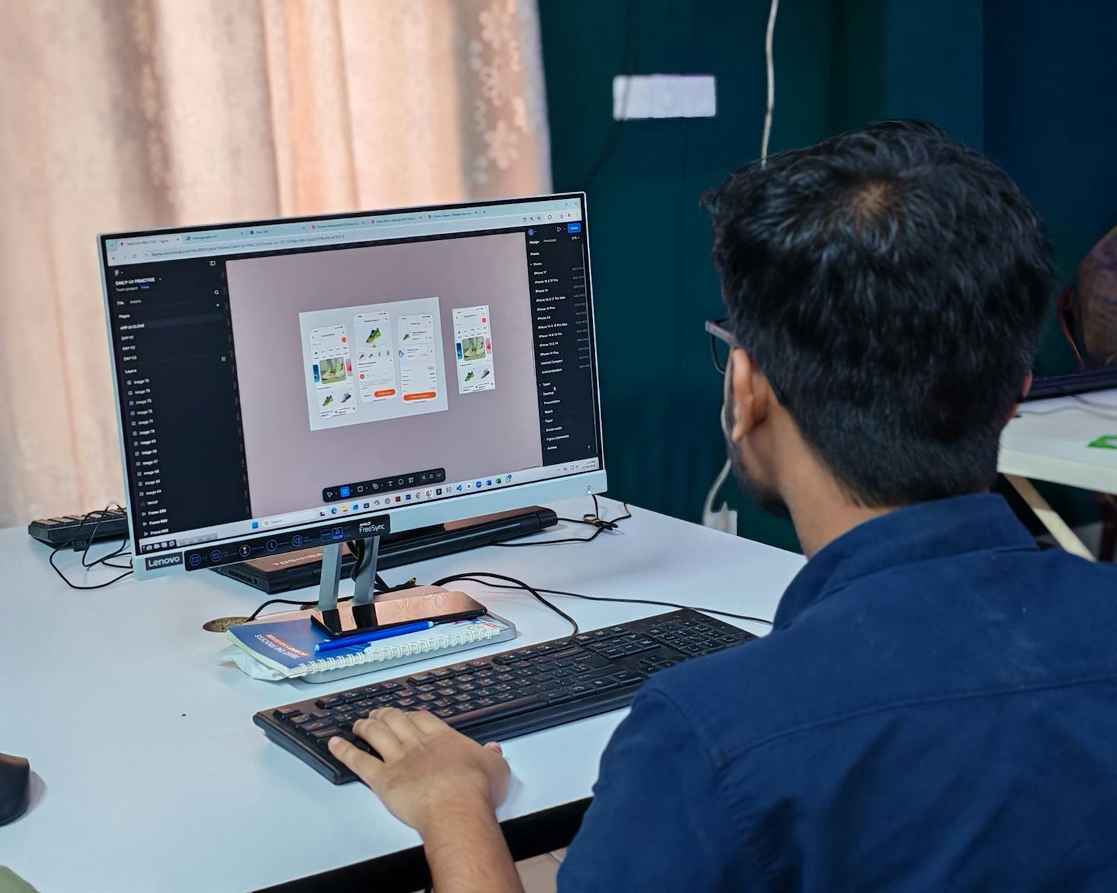
The wrapped-website syndrome
An app that's just a website wrapped inside an app. That's exactly what triggers tons of Apple 4.2 rejections.
Good UX is not only about making an app "beautiful". It is also about reducing the user's anxiety.
When someone opens Airbnb, they often feel something very specific : a sense of immediate trust. And honestly, it's absolutely not by accident.
Because Airbnb works heavily on a topic that's often underestimated in mobile : reducing user doubt.
Before booking anything, the app already answers a lot of implicit questions :
And this is exactly where Airbnb is strong. The app uses huge photos, ratings visible everywhere, detailed human reviews, user profiles, neighborhood info, deadlines, "Superhost" badges, very visible cancellation policies.
None of this is purely informational. It's mainly reassurance. And that nuance is extremely important.
Because good UX isn't only about making an app "beautiful". It's also about reducing anxiety.
When a user doubts, they hesitate, they compare, they delay the decision, sometimes they leave the app entirely.
Airbnb understood very early that booking a stay between strangers can be stressful. So the app constantly works on trust. This approach is very close to what Apple's Human Interface Guidelines call "clarity" — the first of the three design principles.
Even elements that look like "marketing" often have a psychological function :
Everything is designed to help the user make a decision more calmly.
Today, many products still think "features". The best apps think "emotions". And that difference changes a lot.
Because in the end, the user doesn't memorize your feature list. They memorize how they felt during their journey.
Want to reduce doubt in your app's purchase flow ? Book a 15-minute call to identify the moments where your user is still hesitating.
12 years of experience, iOS + Android, one dedicated contact. Free 15-minute call to scope your need — no commitment, no jargon.
Book a call →
When someone opens Airbnb, they often feel something very specific : a sense of immediate trust. And honestly, it's absolutely not by accident.
Because Airbnb works heavily on a topic that's often underestimated in mobile : reducing user doubt.
Before booking anything, the app already answers a lot of implicit questions :
And this is exactly where Airbnb is strong. The app uses huge photos, ratings visible everywhere, detailed human reviews, user profiles, neighborhood info, deadlines, "Superhost" badges, very visible cancellation policies.
None of this is purely informational. It's mainly reassurance. And that nuance is extremely important.
Because good UX isn't only about making an app "beautiful". It's also about reducing anxiety.
When a user doubts, they hesitate, they compare, they delay the decision, sometimes they leave the app entirely.
Airbnb understood very early that booking a stay between strangers can be stressful. So the app constantly works on trust. This approach is very close to what Apple's Human Interface Guidelines call "clarity" — the first of the three design principles.
Even elements that look like "marketing" often have a psychological function :
Everything is designed to help the user make a decision more calmly.
Today, many products still think "features". The best apps think "emotions". And that difference changes a lot.
Because in the end, the user doesn't memorize your feature list. They memorize how they felt during their journey.
Want to reduce doubt in your app's purchase flow ? Book a 15-minute call to identify the moments where your user is still hesitating.
12 years of experience, iOS + Android, one dedicated contact. Free 15-minute call to scope your need — no commitment, no jargon.
Book a call →We write about mobile app development, user experience design, App Store optimization, project management, and industry trends. Our articles are based on real experience from client projects.
We aim to publish regularly with a focus on quality over quantity. Each article is written from hands-on experience, not generic advice.
Absolutely! Feel free to reach out via our contact page or book a consultation. We love hearing what questions our readers and clients have.