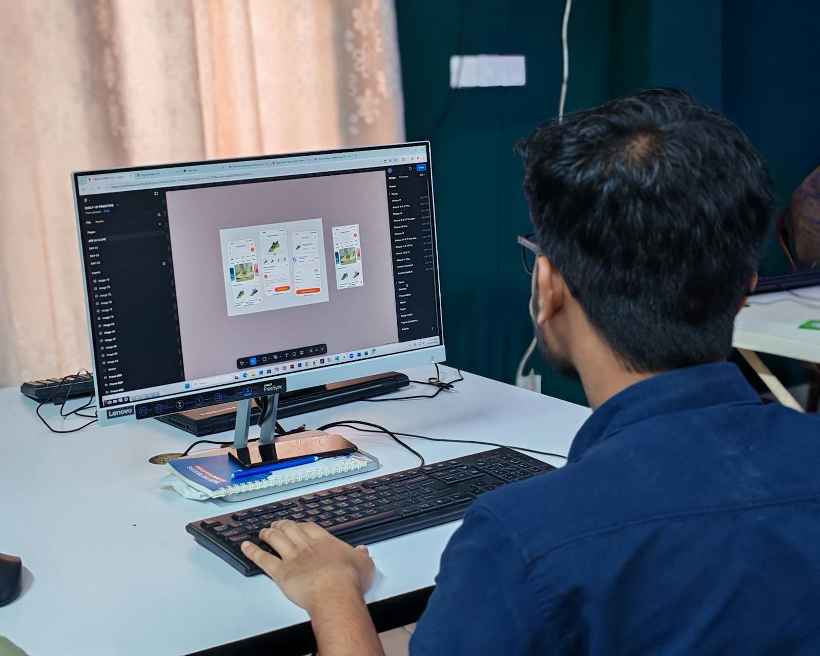
The fake "perfect button"
"Let's redo the button again." Meanwhile, the real product problem stays elsewhere. The product is trying to look prett…
 Mickael Romaniello
30 minutes, no slides, nothing to prepare.
Mickael Romaniello
30 minutes, no slides, nothing to prepare.
Notifications, popups, tooltips, emails, tutorials, reminders, promotions. Some apps talk a lot. Too much. And it gets exhausting fast.
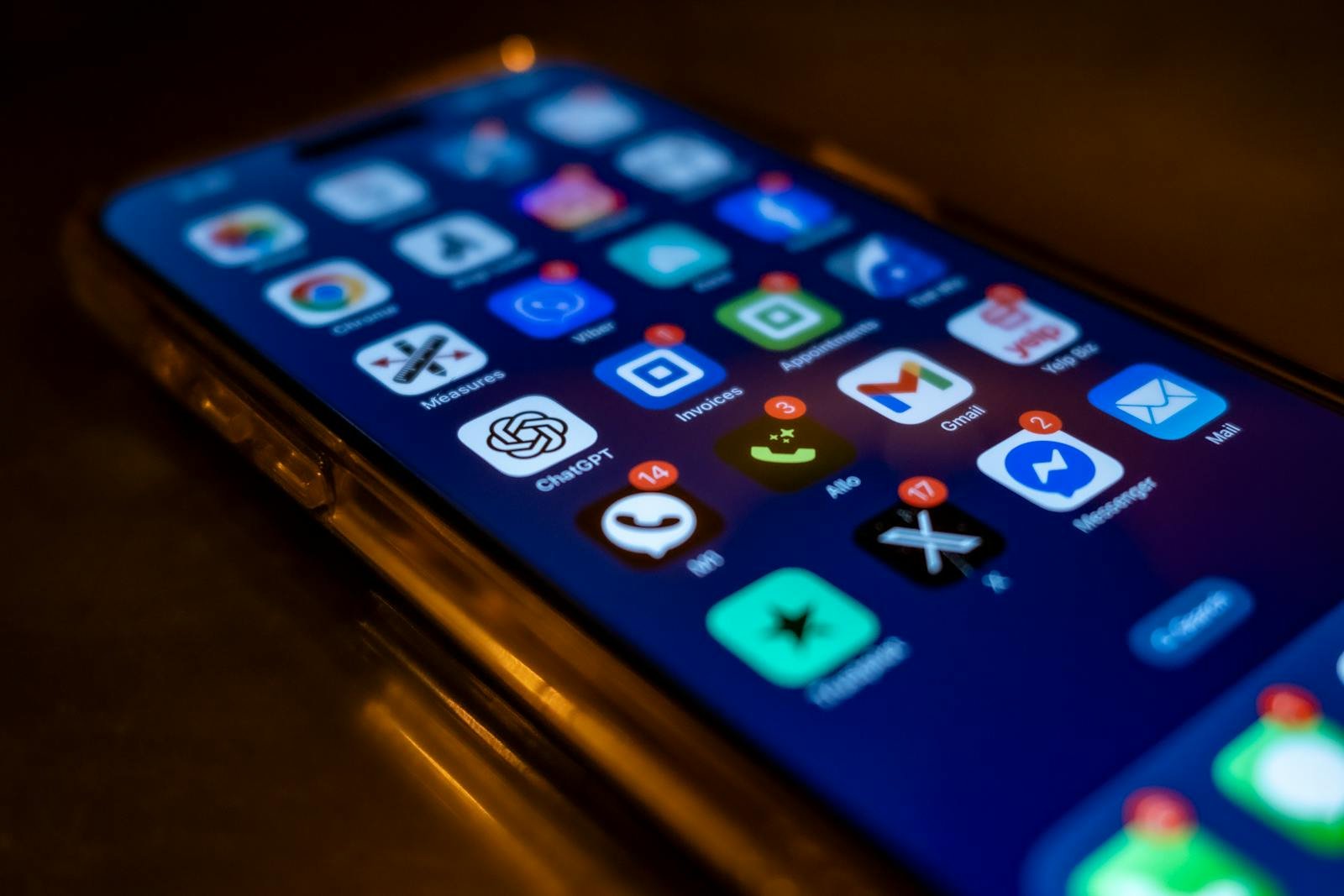
Notifications. Popups. Tooltips. Emails. Tutorials. Reminders. Promotions.
Some apps talk a lot. Too much. And honestly, it gets exhausting fast.
The problem is that often, the starting intent is good. The app wants to help, explain, guide, bring the user back, show what's new.
But by trying to grab attention everywhere… nothing feels truly important anymore.
The human brain has limited attention. And on mobile, that fatigue hits even faster. Because the phone is already full of solicitations all day long.
So when an app adds more noise, the user often disengages. According to Statista (2024), more than 60% of users disable notifications from at least one app every month.
The real luxury today isn't necessarily having more features. It's sometimes simply having a calm experience.
An app that knows :
The best mobile products aren't constantly shouting. They pick their moments. And that restraint often creates a much more premium feeling.
Many projects still think "The more we communicate, the better." But on mobile, too much communication quickly becomes aggression.
And often, users react in a very simple way : they cut notifications. Or they delete the app.
Apple's notifications guidelines are explicit : every notification must be relevant, timely and personal. Otherwise it becomes spam.
Good UX isn't only about showing things. It's also about not overloading the user unnecessarily.
Does your app know when to stay silent ? Book a 30-minute call to audit the product noise that's pushing users away.
12 years of experience, iOS + Android, one dedicated contact. Free 30-minute call to scope your need — no commitment, no jargon.
Book a call →
Notifications. Popups. Tooltips. Emails. Tutorials. Reminders. Promotions.
Some apps talk a lot. Too much. And honestly, it gets exhausting fast.
The problem is that often, the starting intent is good. The app wants to help, explain, guide, bring the user back, show what's new.
But by trying to grab attention everywhere… nothing feels truly important anymore.
The human brain has limited attention. And on mobile, that fatigue hits even faster. Because the phone is already full of solicitations all day long.
So when an app adds more noise, the user often disengages. According to Statista (2024), more than 60% of users disable notifications from at least one app every month.
The real luxury today isn't necessarily having more features. It's sometimes simply having a calm experience.
An app that knows :
The best mobile products aren't constantly shouting. They pick their moments. And that restraint often creates a much more premium feeling.
Many projects still think "The more we communicate, the better." But on mobile, too much communication quickly becomes aggression.
And often, users react in a very simple way : they cut notifications. Or they delete the app.
Apple's notifications guidelines are explicit : every notification must be relevant, timely and personal. Otherwise it becomes spam.
Good UX isn't only about showing things. It's also about not overloading the user unnecessarily.
Does your app know when to stay silent ? Book a 30-minute call to audit the product noise that's pushing users away.
12 years of experience, iOS + Android, one dedicated contact. Free 30-minute call to scope your need — no commitment, no jargon.
Book a call →We write about mobile app development, user experience design, App Store optimization, project management, and industry trends. Our articles are based on real experience from client projects.
We aim to publish regularly with a focus on quality over quantity. Each article is written from hands-on experience, not generic advice.
Absolutely! Feel free to reach out via our contact page or book a consultation. We love hearing what questions our readers and clients have.
Most of my projects run remotely, and in practice that changes very little. We talk over video whenever you need to, not only at major milestones, and you can reach me with questions at any point during the project — I always answer.
You can also write to me directly on WhatsApp: same number I use every day, a French professional line that works internationally.