The wrapped-website syndrome
An app that's just a website wrapped inside an app. That's exactly what triggers tons of Apple 4.2 rejections.
An overloaded interface does not reassure your patients — it drives them away. Here is why visual sobriety is the true pillar of a mobile app in the healthcare sector.

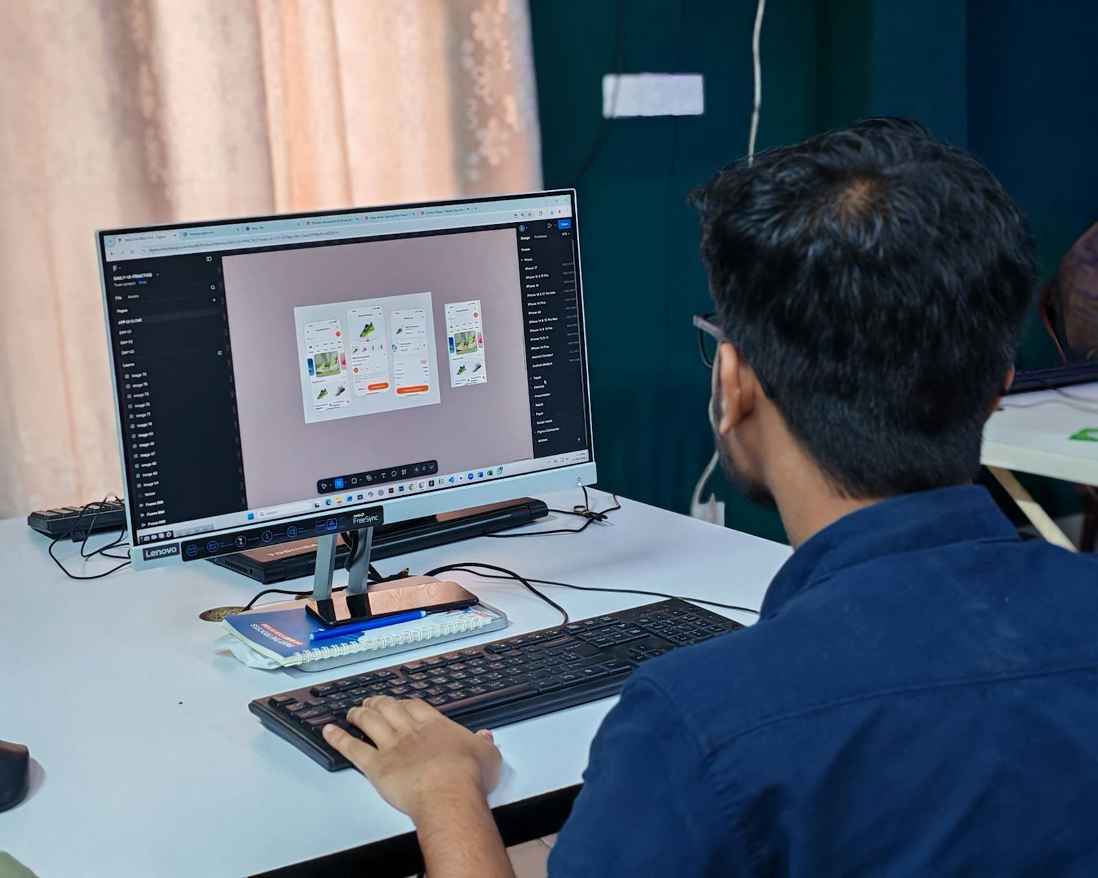
The topic of mobile health is at the heart of many discussions today. Many leaders think an app is just another technical tool. This vision severely limits your company's growth potential. As a Product Engineer, I see the app as a major strategic lever. It allows you to create a direct and permanent link with your most loyal patients. But to succeed, you must avoid the classic design pitfalls.
The first mistake is often wanting to do too much at launch. People imagine that an endless catalog of features will reassure the end user. In daily reality, the exact opposite happens. The patient feels lost facing an interface that is too complex and unintuitive. They are looking for a quick solution to a specific problem they have right now. If your app is a convoluted mess, they will uninstall it without hesitation.
Simplicity is hard work that requires a lot of strategic perspective. You have to know how to say no to certain ideas to protect the product's clarity.
Invisible technical quality is the second pillar of your success. We are not talking about lines of code or complex servers to understand here. We are talking about the fluidity your patient feels with every tap of their thumb. An app that takes too long to load a page destroys trust. The human brain associates technical sluggishness with a lack of professionalism.
This is why I attach paramount importance to performance optimization. Your internal engine must be invisible, silent, and fiercely effective. This is what turns a simple visit into a lasting habit.
The investment in a mobile app must be viewed long-term. It is not a one-time expense that you forget once the product is published. The mobile market evolves at lightning speed every single month. Apple and Google update their rules and systems constantly. Without rigorous maintenance, your app will become obsolete very quickly.
Proactive maintenance is the life insurance of your digital capital. It allows you to adjust based on the actual feedback from your users. It is by listening to the field that we build the best evolutions.
The added value must be obvious from the first seconds of use. If the user has to read a manual, the design has failed. Every screen must have a single, perfectly understandable objective. We work together to remove all unnecessary friction from the user journey. The fewer steps there are, the more your organization's conversion rate increases.
Fluidity is your best ally in generating trust. A satisfied patient is a patient who won't go checking out the competition. Your app is your best ambassador in your users' pockets.
Do not let technical complexity slow down your ambitions. Let's build a product together that respects your patients and your goals. The method I propose relies on efficiency and total transparency.
Book a 15-minute call to discuss your mobile project.
12 years of experience, iOS + Android, one dedicated contact. Free 15-minute call to scope your need — no commitment, no jargon.
Book a call →
The topic of mobile health is at the heart of many discussions today. Many leaders think an app is just another technical tool. This vision severely limits your company's growth potential. As a Product Engineer, I see the app as a major strategic lever. It allows you to create a direct and permanent link with your most loyal patients. But to succeed, you must avoid the classic design pitfalls.
The first mistake is often wanting to do too much at launch. People imagine that an endless catalog of features will reassure the end user. In daily reality, the exact opposite happens. The patient feels lost facing an interface that is too complex and unintuitive. They are looking for a quick solution to a specific problem they have right now. If your app is a convoluted mess, they will uninstall it without hesitation.
Simplicity is hard work that requires a lot of strategic perspective. You have to know how to say no to certain ideas to protect the product's clarity.
Invisible technical quality is the second pillar of your success. We are not talking about lines of code or complex servers to understand here. We are talking about the fluidity your patient feels with every tap of their thumb. An app that takes too long to load a page destroys trust. The human brain associates technical sluggishness with a lack of professionalism.
This is why I attach paramount importance to performance optimization. Your internal engine must be invisible, silent, and fiercely effective. This is what turns a simple visit into a lasting habit.
The investment in a mobile app must be viewed long-term. It is not a one-time expense that you forget once the product is published. The mobile market evolves at lightning speed every single month. Apple and Google update their rules and systems constantly. Without rigorous maintenance, your app will become obsolete very quickly.
Proactive maintenance is the life insurance of your digital capital. It allows you to adjust based on the actual feedback from your users. It is by listening to the field that we build the best evolutions.
The added value must be obvious from the first seconds of use. If the user has to read a manual, the design has failed. Every screen must have a single, perfectly understandable objective. We work together to remove all unnecessary friction from the user journey. The fewer steps there are, the more your organization's conversion rate increases.
Fluidity is your best ally in generating trust. A satisfied patient is a patient who won't go checking out the competition. Your app is your best ambassador in your users' pockets.
Do not let technical complexity slow down your ambitions. Let's build a product together that respects your patients and your goals. The method I propose relies on efficiency and total transparency.
Book a 15-minute call to discuss your mobile project.
12 years of experience, iOS + Android, one dedicated contact. Free 15-minute call to scope your need — no commitment, no jargon.
Book a call →We write about mobile app development, user experience design, App Store optimization, project management, and industry trends. Our articles are based on real experience from client projects.
We aim to publish regularly with a focus on quality over quantity. Each article is written from hands-on experience, not generic advice.
Absolutely! Feel free to reach out via our contact page or book a consultation. We love hearing what questions our readers and clients have.